
Showing posts with label Unit 2 Space. Show all posts
Showing posts with label Unit 2 Space. Show all posts
Tuesday, 30 November 2010


Sunday, 28 November 2010


Third concept - cave
On this Concept my main focus was extreme depth, what I had noticed with looking at other images is that a larger cave looked so much more dramatic than a smaller cave. Drama is what I wanted to happen. when it came to the style, I chose to create a lot of silhouette's casted by a single light.


 The overlay tool has become extremely useful, with it I have created a really nice blend on cool browns. At the moment i like the way it looks somewhat like game art.


I wanted to experiment with an overlaying colour, of yellow, red and blue. They all turned out really beautiful and gave the image a totally different look. My favourite one is the blue one but the yelow and red ones has a connection the african background so those are the ones I'm need to swing towards most.


 The overlay tool has become extremely useful, with it I have created a really nice blend on cool browns. At the moment i like the way it looks somewhat like game art.

I wanted to experiment with an overlaying colour, of yellow, red and blue. They all turned out really beautiful and gave the image a totally different look. My favourite one is the blue one but the yelow and red ones has a connection the african background so those are the ones I'm need to swing towards most.


Thursday, 25 November 2010
Second final piece
 The second final piece, I know I needed to improve what I had previously uploaded, so I went back into it with the style I've been developing but stronger. What I made stronger was the extreme contrast of silhouettes and colour. What I found hard was trying to show atmosphere in depth aswell as the shadow.
I tried to keep the shapes slightly curved to keep the viewers eyes circling over the middle of the piece. I really like this piece, mainly because I've kept close to the style of african art of colour, silhouettes and blocked shapes. I think the sky really works in sense of distance, I like how it looks like it's stretching back behindthe mountains.
first final concept and preparatory studies
Here is my first final concept piece plus the stages in which got me to the final result, I will be explaining what I was trying to achieve in some of the slides.


I had already created the scene and composition in black and white, and at this stage I wanted to create a contrast in the strongest light to the possible darks. I wanted the pile of treasure to be the brightest area in the concept.

Experimenting
 A quick flip to check if everything was working. Still a lot of work to go but at this stage im happy with how it's looking.

Another experiment. This time i've added a lot of colour bouncing around on the far wall. what I like about this technique is the new sense of depth the piece has and the colour explosion. What I dont like about it though is the way it looks too much like disco lights.


Here im just playing around with the composition of the piece, I've extended the piece horizontaly, i like the way it makes the piece look longer.

 After this slide, I thought I was finished but when I got an outside opinion, the first thing the viewer said was ahhhhh its scary it looks like teeth. So i went back into it too get rid of the teethy look.
  This is what I came up with, I erased the top middle stalactite and increased the colour of the rays of light. I'm realy glad I did this, it brings back the colour style i was using before and it hides the rocks a bit more.
  This is the final piece, I toned done the colour just a little bit because it was hiding the large door in the background and I didnt like that. I'm really happy with my first final concept, it makes me want to go into my previous designs and really gointo them and develop them further.


I had already created the scene and composition in black and white, and at this stage I wanted to create a contrast in the strongest light to the possible darks. I wanted the pile of treasure to be the brightest area in the concept.

Experimenting
 A quick flip to check if everything was working. Still a lot of work to go but at this stage im happy with how it's looking.
Another experiment. This time i've added a lot of colour bouncing around on the far wall. what I like about this technique is the new sense of depth the piece has and the colour explosion. What I dont like about it though is the way it looks too much like disco lights.


Here im just playing around with the composition of the piece, I've extended the piece horizontaly, i like the way it makes the piece look longer.

 After this slide, I thought I was finished but when I got an outside opinion, the first thing the viewer said was ahhhhh its scary it looks like teeth. So i went back into it too get rid of the teethy look.
  This is what I came up with, I erased the top middle stalactite and increased the colour of the rays of light. I'm realy glad I did this, it brings back the colour style i was using before and it hides the rocks a bit more.
  This is the final piece, I toned done the colour just a little bit because it was hiding the large door in the background and I didnt like that. I'm really happy with my first final concept, it makes me want to go into my previous designs and really gointo them and develop them further.
Tuesday, 23 November 2010
Thumbnails
here are the next bunch of thumbnails, I had forgotten to post these up and for that I appologise. these thmbnails have come in handy, without them it would be extremely difficult to work out the compostition


I really like this one, it looks like everything that would be in africa, a clear wide open plain, rocks, talls mountains and a large sky. I would like to do a photoshoped colour version, maybe I coulddevelop it into a final piece.


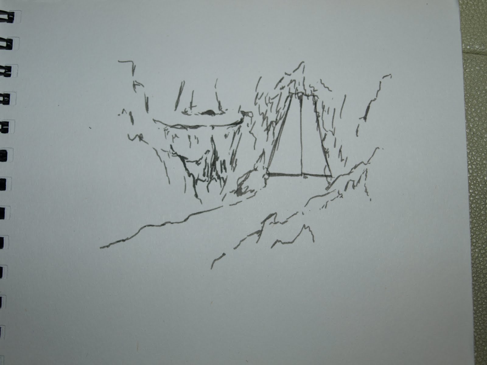
With these two thumbnails, I wanted to find the best possible camera angle, be it from above, from the side, or from the bottom. What i wanted from the camera angles is the best way to get height.


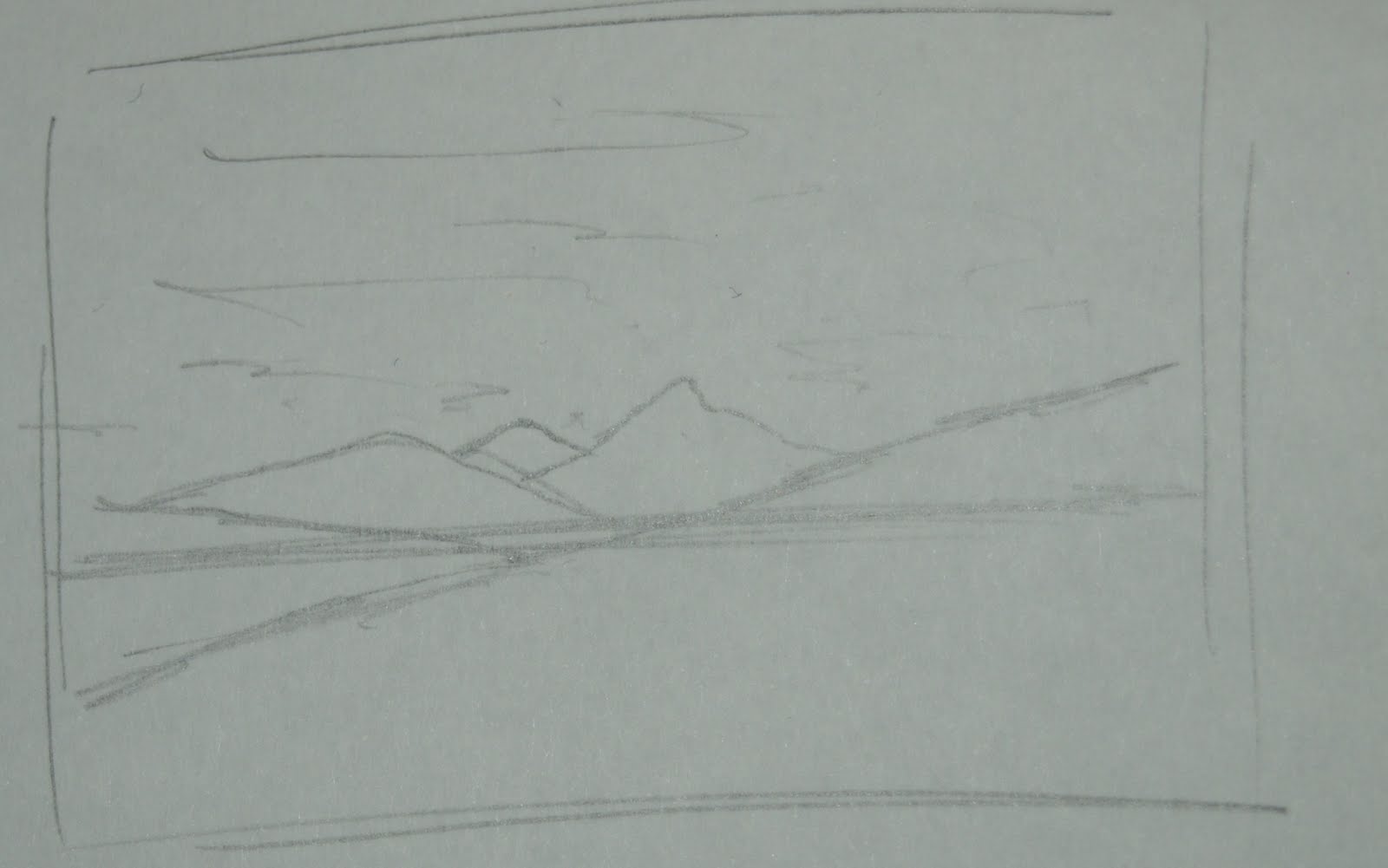




I really like this one, it looks like everything that would be in africa, a clear wide open plain, rocks, talls mountains and a large sky. I would like to do a photoshoped colour version, maybe I coulddevelop it into a final piece.


With these two thumbnails, I wanted to find the best possible camera angle, be it from above, from the side, or from the bottom. What i wanted from the camera angles is the best way to get height.


Subscribe to:
Posts (Atom)