Showing posts with label Year Two. Show all posts
Showing posts with label Year Two. Show all posts
Monday, 28 May 2012
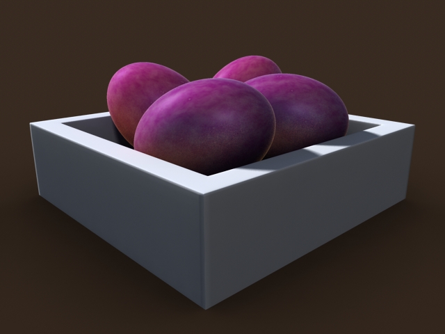
Dynamics 3: Intro to Dynamic Bodies
Chain
Ear ring
Newton's Cradle
Marble
Rope Bridge
Bouncy Castle
Flags
Snow

Netting
Saturday, 26 May 2012
Lighting and Rendering 3: Intro to Metal Ray Continued
Using Ambient Occlusion with Displacment maps

Sub Surface Scattering Part 1: Grapes
Sub Surface Scattering Part 2: Cartoon Shader
Ambient Occlusion Lighting and Light Decay

Mental Ray: Using Maya Layered Shaders with Mental Ray Nodes

Mental Ray: Round Corners Node

Thursday, 24 May 2012


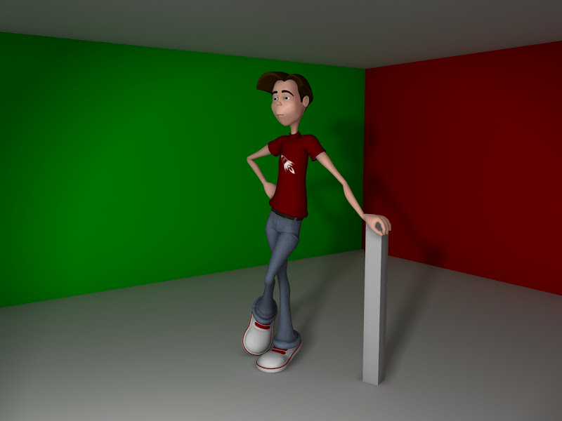
Modelling, Rigging and texturing
This was an interesting process, it involved me going back and fourth because I think I move to hastily through each stage which led to problems in the next stages
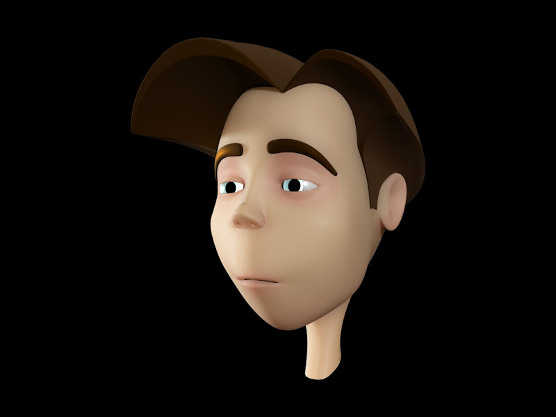
Modelling

At first I tried to keep the geometry as simple as possible so that skinning wouldn't become too much of a problem to handle. However to get things to work, I had to return to modelling and sort out the shoulder areas with extra sweeping curve geometry.
Fur

For the hair, I used the Dreadlock preset in Fur. This was the first time I had used fur and it was an interesting experience. I took my time in the sorting out the setting until I was happy with it. At this stage I couldn't get the hair to be the colour I wanted but I would sort it later.
Texturing

Rigging

Rigging and Skinning turned out to be very difficult! Skinning in perticular was troublesome become vertices ended up all over the place for days. I fixed most of them but in the animation, some of the vertices aren't where they should be.
10 second ident - half finished
The renders are taking a lot longer than expected, grrr.
But I have put a playblast with the renders I have and added some sounds. I'm just waiting for the renders to finish and then will add them in.
I will update the progress in Post as I carry on.
Hope all enjoy it so far....
Slash design
Long Time no Post! Woops!....
But anyways, here are is the design for Slash.
I was advised by Alan to go down the 2 head height style of south park or the three head height style of mickey mouse.
I chose to go down the 2 head height style and this is what I got.


But anyways, here are is the design for Slash.
I was advised by Alan to go down the 2 head height style of south park or the three head height style of mickey mouse.
I chose to go down the 2 head height style and this is what I got.


I wanted to experiment with making the features of Slash extreme.


These are is my final design and turnaround.

Monday, 7 May 2012
Slash Designs
I've picked Slash as the character for the ident because his look is very iconic. I want to keep a simplified look for the design but keep his iconic look. I have found a coupl eof images online of Slash and then turned them into toonic designs.
Slash's hair and hat is where his iconic look is strongest so I want to consentrate on keeping that look, the rest is not as important.


Slash's hair and hat is where his iconic look is strongest so I want to consentrate on keeping that look, the rest is not as important.

Default Sheet - I started with a guide size of seven and a half heads in length.

Slash Design one - I like the t-shirt in this image

Slash design three - In this image I liked the jacket and wanted to see what it was like with the t-shirt from above. I think this is quite a nice one.

Three head Default Sheet

This one was to what it would look like with a stylised version. It okay however it is not good enough for what I need.
Step by Step guide for myself
Just to keep myself on track with everything, I'm going to but down what I need to have done by the deadline day in just under 3 weeks.
Refine Storyboard - up to a point where the action for every second is set in stone and confirmed. I normally have problems in the animation stage because I do this step too fast. Hopefully by doing this I will know what every frame will look like.
Character Designs for Slash - This is so the modelling stage goes swiftly and precisely. What I want from this, is a design that is simple enough for the modelling and animation purposes but still look iconic enough to look like him from a distance because in the ident, he will be quite small at one point.
Create Turnarounds
Model and colour the Character - Keep in mind that the character must stay simple and with smooth geometry.
Skinning and Rigging - If the previous stage is done right then this stage should be relatively simple. Bare in mind the characters movement isn't going to be a large amount, so a complicated rig is not needed.
Model and Texture other objects in the scene
Find the Music and Sounds
Explosion Tests - This will be an experiment to see what kind of particles can be used and in what way. Also this test will involve how the speaker will be blown up and how Slash will be effected by the blast.
Start Animating
Finish Animating
Rendering
Post - Production
Submission
new idea with storyboard
After my meeting with Alan, he managed to point me in the right direction. He help me understand that Classic Rock was all about being over the top, larger than life, being crazy and totally mad. He suggested that I use this as an essences to the ident.
So I have come up with an idea of a 3d stickman version of Slash plugging his guitar into an extremely large over the top speaker. He strums his guitar and then the speaker blows up, from the smoke that is left comes stadium lights and lasers. this is the followed by a sign saying "Classic Rock Week". The scene ends and then shows the MTV logo.

So I have come up with an idea of a 3d stickman version of Slash plugging his guitar into an extremely large over the top speaker. He strums his guitar and then the speaker blows up, from the smoke that is left comes stadium lights and lasers. this is the followed by a sign saying "Classic Rock Week". The scene ends and then shows the MTV logo.

Monday, 30 April 2012
Developing the Classic Rock idea
I'm going to go with the classic rock idea and going to keep with the idea that the animatic is creating. However the animatic is no where near at a standard i would like it to be. I have had a chat with Phil and recommends that I take a look at classic rock live performances and showed me the trailer to "Rock of ages". He suggested that I record the animation from at least 10 different camera angles and then edit them to a quick beat of the music. He also recommended that I keep the smoke, and lights ideas but also throw in some lasers and fireworks going up and down. This will make the scene look over dramatic and exciting, very ROCK AN ROLL!!!
I have taken a look at Live shows like Gun's and Roses live at Tokyo and Queen live at Wembley and Live 8. The stages are very large, some have screens at the back and some have many levels. I noticed that the more ROCK like the band, the more lights, lasers and smoke.
From the research I have drawn up a couple of stage drawing and possible outlooks. The stages involve different lights, lasers and smoke machines.


Wednesday, 25 April 2012
Idea for the Classic Rock Option With Basic Storyboard and Pre-vis
I had a simple idea of the MTV logo being made of music instruments. The logo will be on a stage coming up from a trap door with smoke billowing around the base.
I have drawn a short storyboard and created a simple pre-vis to show how I saw the idea. This is VERY basic and the final would be improved much further with possible stylisation
Heres the Storyboard

And the Pre-Vis
I have drawn a short storyboard and created a simple pre-vis to show how I saw the idea. This is VERY basic and the final would be improved much further with possible stylisation
Heres the Storyboard

And the Pre-Vis
Tuesday, 24 April 2012
80's albums for ideas
Alan suggested for the 80's option I should use Album covers of mid 80's music so it focuses closer on the style of the 80's.
Bon Jovi's "Living on a prayer" 1986

Def Leppard "Pour some sugar on me" 1987

Guns and Roses "Sweet child of mine"

80's style
The option that interests me most at the moment is the 80's week. I want to have a lot of colour and vectors jumpig around to a beat.


I plan to concentrate my 80's ideas on the vector art created at that time.
MTV Adverts
I wanted to start my research by looking at a few idents that MTV have used before. What I have noticed is that all of the adverts are very alive and very abstract. Vibrant colours seem to be important and if there is music playing over the top, the text will beat with the music on most occasions. I have also found some adverts designed for MTV that have been created by students and others that are also playing around with MTV's style. I shall look further into these as well.
Marie Baldini's work
http://www.youtube.com/user/MarieUbaldini
Marie Baldini's work
http://www.youtube.com/user/MarieUbaldini
Models and Metaphors Project brief and Task ahead
The Brief
Models & Metaphors
Unit Code: RCGA2006
Level & Credit: 15 Credits
When taught: Semester 4
Duration: 5 weeks
Learning hours: 150
Content
CG arts and animation offers a rich source of metaphoric language that captures a sense of ‘future, fashion and the creative zeitgeist’. The illustration of concepts for new and more established companies and institutions provides important commissions for CG arts and animation. They all seek to establish their identities through metaphoric references to their qualities, often linking aspects of ‘physical’ identification to a broader range of conceptual connotations.
This unit requires the development of a speculative and innovative approach to the promotion of products, organisations and services. It encourages investigation into the construction of brands and identities, and considers examples drawn from contemporary practice, where the potential of digital interventions has made possible the representation of conceptual ideas for advertising, promotion and marketing.
Aims
A1 To extend the ability to engage creatively with digital modelling in the development of metaphoric contexts to promote services, organisations and products
A2 To consolidate through ‘live’ commission the skills associated with research, critical analysis, and communication
A3 To consolidate creative design synthesis and the technical skills required to exploit them
Learning Outcomes
On completion of this unit you should demonstrate:
LO1 A developed ability to research and develop creative solutions that promote services, organisations and products
Learning Outcomes Cont…
LO2 An awareness of brand design and the need for continuity in the conceptual development of ideas and aesthetics
LO3 The developed ability to appropriately communicate within a media context to an identified audience
Teaching & Learning Methods
The unit comprises project briefing, software workshops, lectures, seminars, and supporting cultural programme.
Reflective practice / PDP - online journal or blog in which students archive, annotate and reflect critically upon their own creative practice and their peers. Collate information about branding and promotion.
Interim Critique, tutorials, assessment feedback.
Assessable Components
Commission: 100%
For this five week commission you are asked to produce a commercial ‘sting’ for a TV channel’s themed week of programming. You will each be given an envelope containing a TV channel and three themed scheduling options. You are asked to choose one as the basis for your commission and produce a sting advert which promotes the scheduled content and embodies the channels brand identity. For example;
Channel & Options:
The Discovery Channel __________ Week
Egypt, Ocean Predators, or Space Exploration
Commission Choice:
“The Discovery Channels Ocean Predators Week”
Production Criteria:
The ‘sting’ will need to fulfil the following requirements;
• The Sting must contain a CG component(s).
• It must be 10 seconds in length.
• It must contain a suitable audio sting using royalty free source material.
• The sting ‘must’ contain the ‘channel logo’.
• The channel logo must be viewable at the end of the 10 second sting.
Submission & Marking
• A completed 10 second TV Sting in a suitable movie file format.
• An up to date blog detailing your progress throughout the project.
• A .PDF version of your blog submitted on disk
• Completion of all technical tutorials.
• A ‘making of’ book detailing the development of the creative & technical aspects of the project
• Attendance at all tutorials & classes.
Assessment Crtiteria
On completion of this unit you should provide evidence of
Knowledge of Contexts, Concepts, Technologies, Processes
A knowledge and understanding of the promotion and representation of products, services and organisations
Understanding the Application of Knowledge
Innovative approaches to the use of metaphoric language in order to digitally resolve complex communication projects
Developing critical and research skills
Application of Technical Professional Skills
The ability to use and synthesise appropriate software
The ability to manage projects in response to a professional brief
Bibliography
• The 30-Second Storyteller : The Art & Business of Directing Commercials.
T. Richter, Thomson Course Technology PTR (2007).
• The Advertising Concept Book : Think Now, Design Later : A Complete Guide to Creative Ideas, Strategies & Campaigns.
P. Barry, Thames & Hudson (2008).
Bibliography Cont…
• Universal Principles of Design: 100 Ways to Enhance Usability, Influence Perception, Increase Appeal, Make Better Design Decisions, and Teach through Design.
Jill Butler, Katrina Holden, & Will Lidwell, Rockport Publishers Inc. (2007)
• The Graphic Design Exercise Book.
Carolyn Knight & Jessica Glaser, Rotovision (2010).
• Creative Advertising: Ideas and Techniques from the World's Best Campaigns.
Mario Pricken, Thames & Hudson (2008)
• Visual Creativity : Inspirational Ideas for Advertising, Animation & Digital Design.
Mario Pricken, Thames and Hudson (2004).
• Decoding Design: Understanding and Using Symbols in Visual Communication.
Maggie Macnab, How Design Books (2008)
• Illustration Play: Craving for the Extraordinary
Gingko Press, Viction Design Workshop (2007)
• Basics Illustration: Thinking Visually.
Wigan, M, AVA, (2006).
• Visual Storytelling : The Art & Technique.
Tony.C.Caputo, Watson-Guptill (2002).

I have been given the task to create a 10 second sting/ opening animation for a channel with an upcoming special week. What I was given was MTV with the options of 'Classic Rock', 'Street Dance' and the '80's' as the special week of television.
My initial thought was, I'm excited to do the project however the channel was one I really couldn't see myself picking or doing. This shows that I am outside my comfort zone, but perhaps that is what I need to create something great.
...So on with the project...
Thursday, 5 April 2012
Modelling improvements
I had a talk with phil and he revealled a few problems he was having with my character. He thought that the textures were becoming to complex which lead to too much visual information. Another problem was that he wasn't look big enough or anywhere near mean enough. So I have gone back a few steps and created this new fearsome head and made him larger.


I didn't want to make the head TOO different, so i started to think about how he would look under the previous mask that he had, and as the modelling continued I added a few more piece like the elongated chin. The eyes will be covered by small fibres, so that they are simular to the eyes of a flea, which is where the main design where from.


Subscribe to:
Posts (Atom)