Tuesday, 23 November 2010

Thumbnails

here are the next bunch of thumbnails, I had forgotten to post these up and for that I appologise. these thmbnails have come in handy, without them it would be extremely difficult to work out the compostition


I really like this one, it looks like everything that would be in africa, a clear wide open plain, rocks, talls mountains and a large sky. I would like to do a photoshoped colour version, maybe I coulddevelop it into a final piece.


With these two thumbnails, I wanted to find the best possible camera angle, be it from above, from the side, or from the bottom. What i wanted from the camera angles is the best way to get height.


Friday, 19 November 2010

A quick trip to Rochester cathedral

After a conversation with Miss Kayleigh Dean, we decided to go to Rochester cathedral, mainly for my need to research on old structures and perspective. I remembered a line from King Solomon's Mines, on page 243, '.... with the difference of that this cathedral designed by nature was loftier and wider than any built by man'. Just by steping into a cathedral, anyone can tell that it's a building like no other, the towering ceiling, large light giving windows, awesome archways and fabulous detail carved into marble.

What I wanted to take away from this experience was a sense of awe and a possible dread of being in a place with such high walls and ceilings.
It will be interesting to draw the lines that the edges of the walls create and then see what can be made from those lines in the perspective.
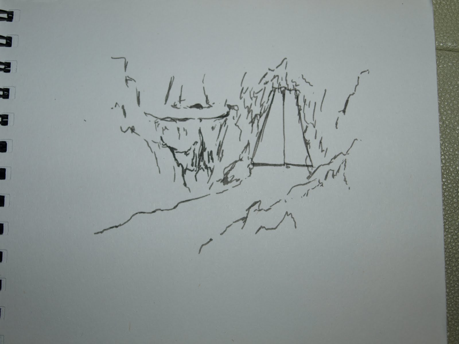
I noticed some artifacts that would go nicely in the treasure room. I've been imagening large stone crates (almost like sarcophaguses) with amazing detail all around it. This is King Solomon's legenary treasure, the treasure room needs to look the part.


The Room downstairs gives an amazing display of perspective around it's pillars, I can see it taking huge effect in such a small amount of space. I find the arching ceiling interesting, I would like to see these half broken or crashing in the floor as a stalagmite and stalagtite connect.


life drawing 16/11/10

When comparing my most resent life drawing studies with studies from previous weeks, it is clear to see that my skill as drawer of the anatomy is improving. I found this lesson highly enjoyable; the freedom of skill mixed with a limitation of colour and materials was a combination that lead to many different techniques and results. What I find most attractive about these coloured drawings is the larger image to the right and the red image in the middle. They both hold a certain elegance to them, the pink one's subtle hint of tone enhances the neck muscles, whereas the red image's stretched phsyic and wrinked form is shown through cross hatching.


Here is a piece that I was given an hour and a half to complete, unfortuantly it is nowhere near completion, which is disappointing because it has plenty of potentional. Getting the full form in was my main focus but when that was complete, I started to focus on the face. Main reason for this is, I find my drawing of faces can be very lifeless and most of the time unaccurate. As a basis, it appears to very close to the subject, which is what I'm always striving towards. If the time limit was an extra hour and a half, this piece could have been something special for me. Next week I aim to work faster to achieve better results in the allicated time.


BRING ON THE NEXT LIFE DRAWING CLASS!!!

Monday, 15 November 2010

concept number 1

Here's a look at what the first concept image could look like, clearly it isn't finished yet but it's comfating to know that I have a basis waiting to be worked on. I've kept in mind the huge factor of colour, deriving from african art. When woking with the clay brush in photoshop, i managed to create this blurry look to the piece, which I become to really like because it adds emphasis of heat to the image. Heat and colour is the two key properties in the african landscape, so I made it a priority in my piece.
The improvements I would like to make is to create a bigger cut of point from land and sky, they blend together to much. The mountains could be brought down slightly and possibly shrink them to enforce foreshortening.